Napa de Oro
About This Project
Abe Marrapao approached us through an amazing friend of ours, Rudy Zuidema, winemaker legend of Napa Valley. Under Rudy’s winemaking, Napa de Oro needed a name, a brand, an entire line of wines already in production, and a fully working shopify website to sell them. The task was daunting, but an incredible experience of diving into the Filipino culture.
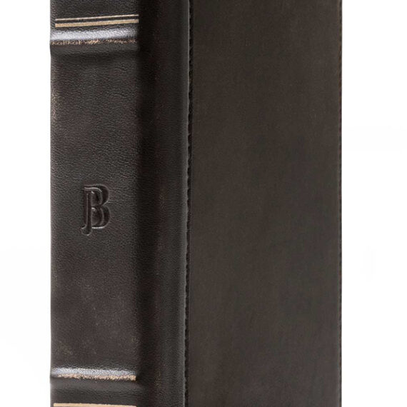
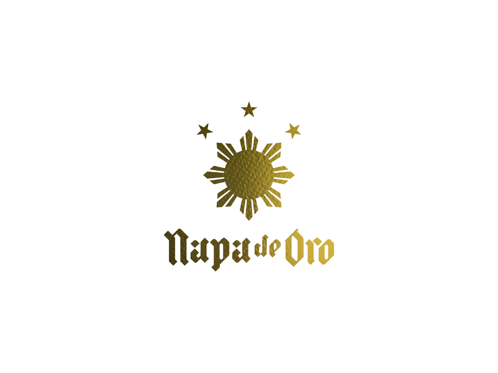
Through Abe’s guidance, we explored a logo that was not only evocative of a luxury estate that has stood the test of time, it also needed to communicate Filipino pride. Abe’s gold mines were a huge influence in this brand design, whereas its name would clearly drive the concept of GOLD. We felt, however, the need to make this an understatement; instead focusing on prestige and legacy.
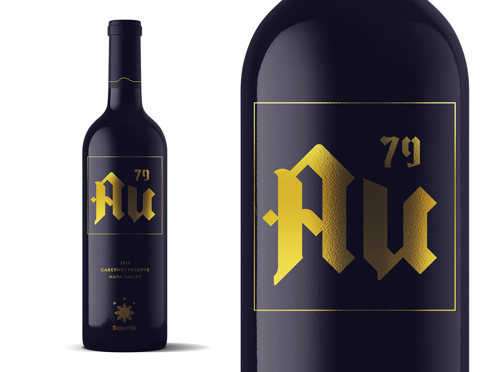
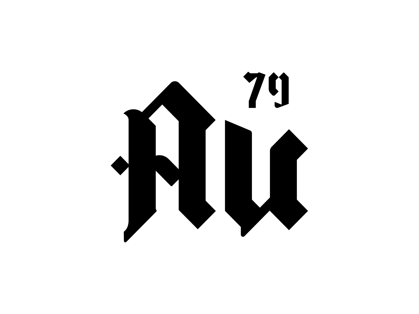
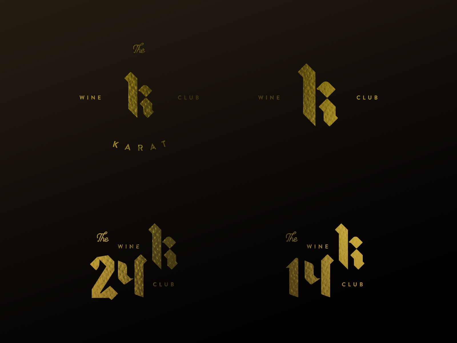
We were extremely honored at the opportunity to design brands within a brand. Abe wanted some significantly planned products he would brand on their own: the AU79 logo, and Karat Clubs. AU79 is the element for Gold. As Napa de Oro’s most excessively delicious varietal of the line, it stands to own its namesake pure metal.
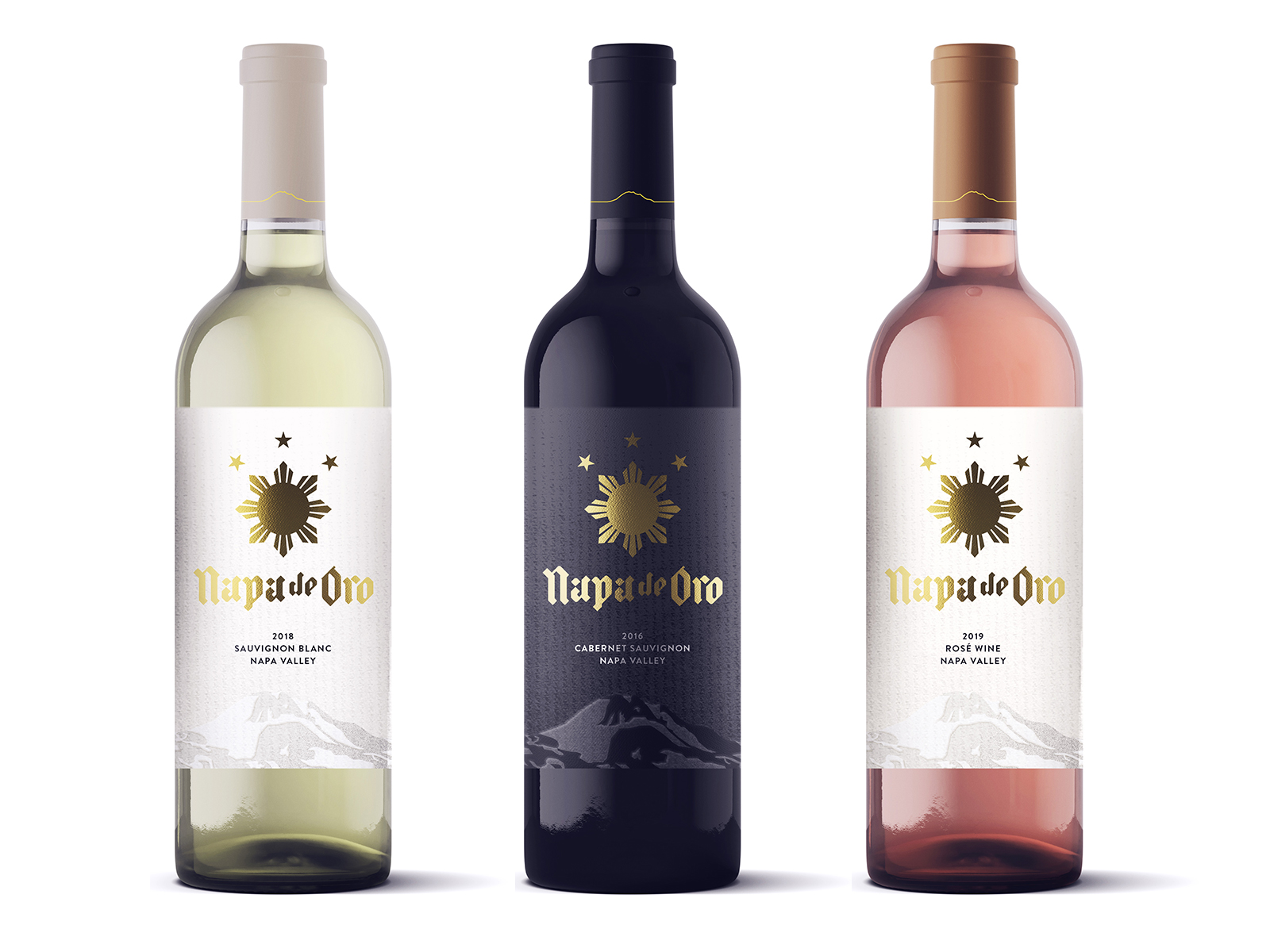
In the end, we achieved a brand that truly speaks of its status amongst the great wines of Napa Valley: Liquid Gold.
Visit: Napa de Oro