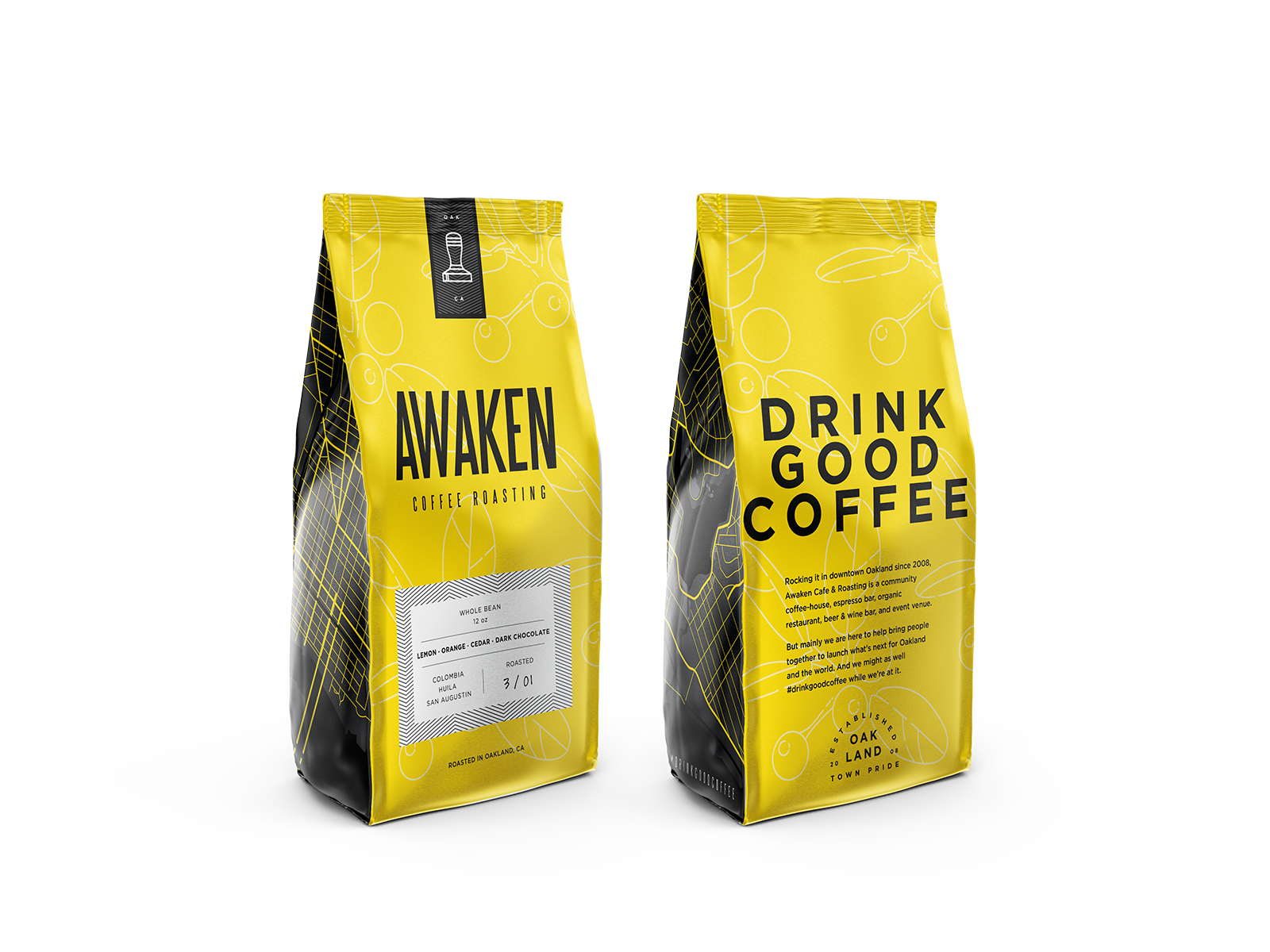
Awaken Coffee
About This Project
In collaboration with Angela Tsay of Oaklandish, we were given the opportunity to redesign the packaging Awaken’s home roasted Coffee. Being that Awaken has stood the test of time, and has earned the title of one of the longest standing roasters and coffee shop in Oakland.
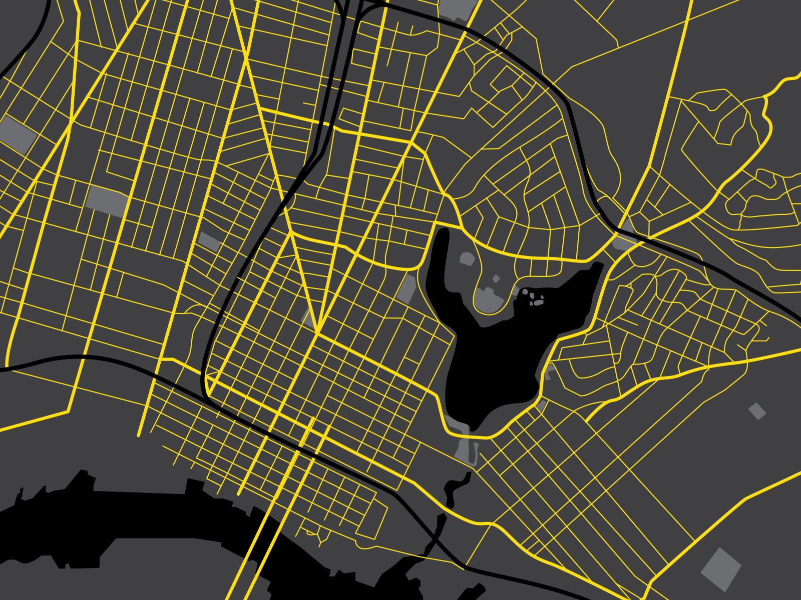
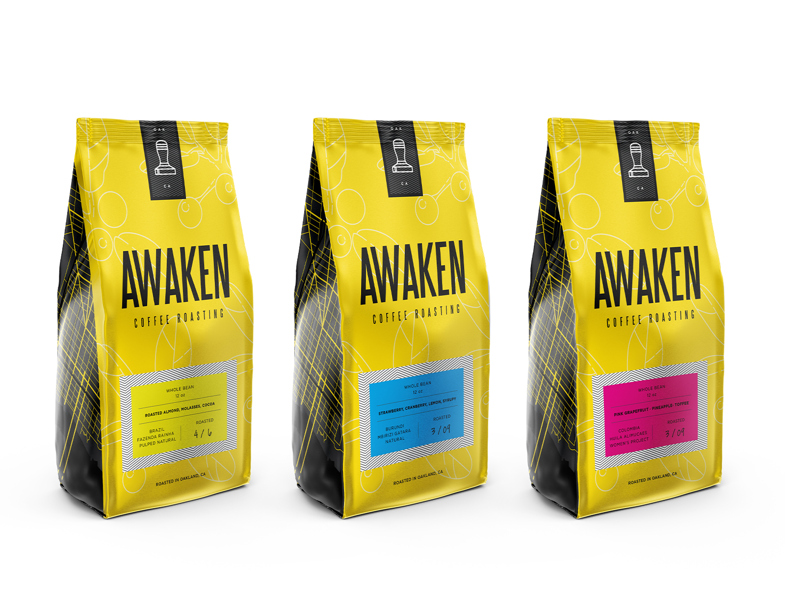
Cortt presented us with a great problem: “Make this cool and stand out on the shelves.” So, we took all the cool from Oakland, gave it the Oaklandish treatment and distilled it into a bag of delicious coffee. To stand out, we used the traditional colors of Bruce Lee’s famous track suit from Game of Death (Bruce started his school in Oakland). To Add some locality, we added the great map of downtown where Awaken has stood since its inception. To add some art, we created simple illustrations of the leaf and fruit, with some clean typography. We are very happy with the turnout.