

Oakland Roots SC



About This Project
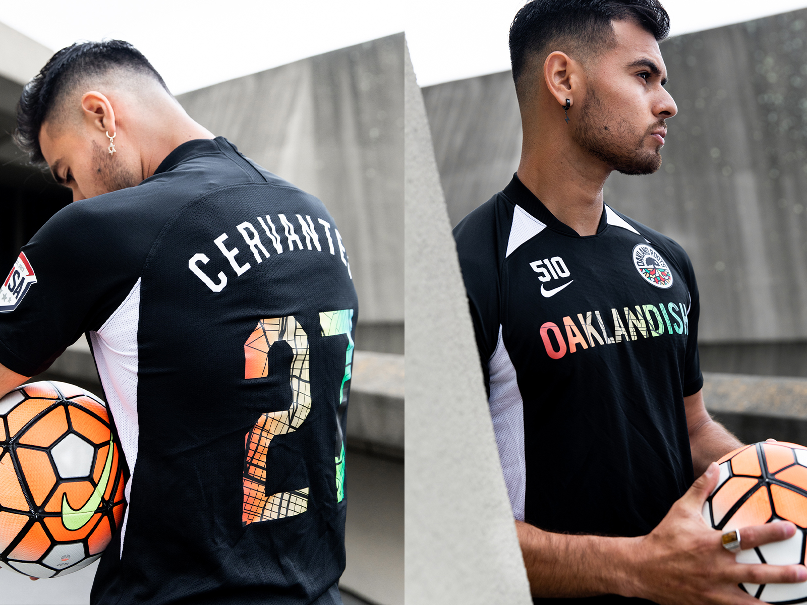
Our friends at Oaklandish put us into an incredibly serendipitous match, with none other than Oakland’s very own soccer team Oakland Roots SC. After their fresh brand design work by Matthew Wolff, we were tasked by the team to give them 2020’s new kit designs. Utilizing a custom designed Oakland map of downtown over a rainbow split fountain print, we developed a kit direction that brought the spirit of the “town.”
A custom map of downtown Oakland, paired with a rainbow split-fountain print treatment, became the defining graphic element. The approach connected the team’s visual presence on the pitch with the neighborhoods and culture that surround it.
Featured in Hypebeast, (credit: Luis Ruano) the project brought local storytelling into sports apparel through custom graphics and production-aware design.
We’re not saying we have favorite projects but this one was pretty fun.