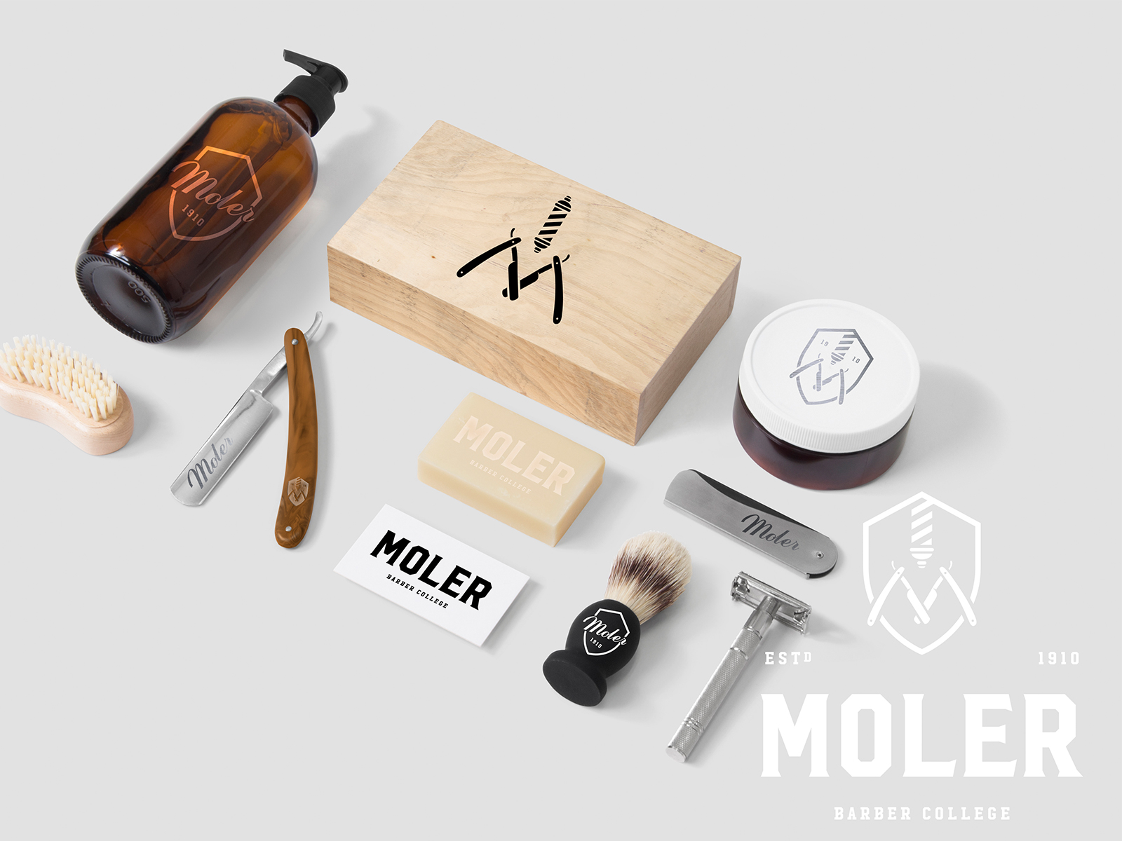
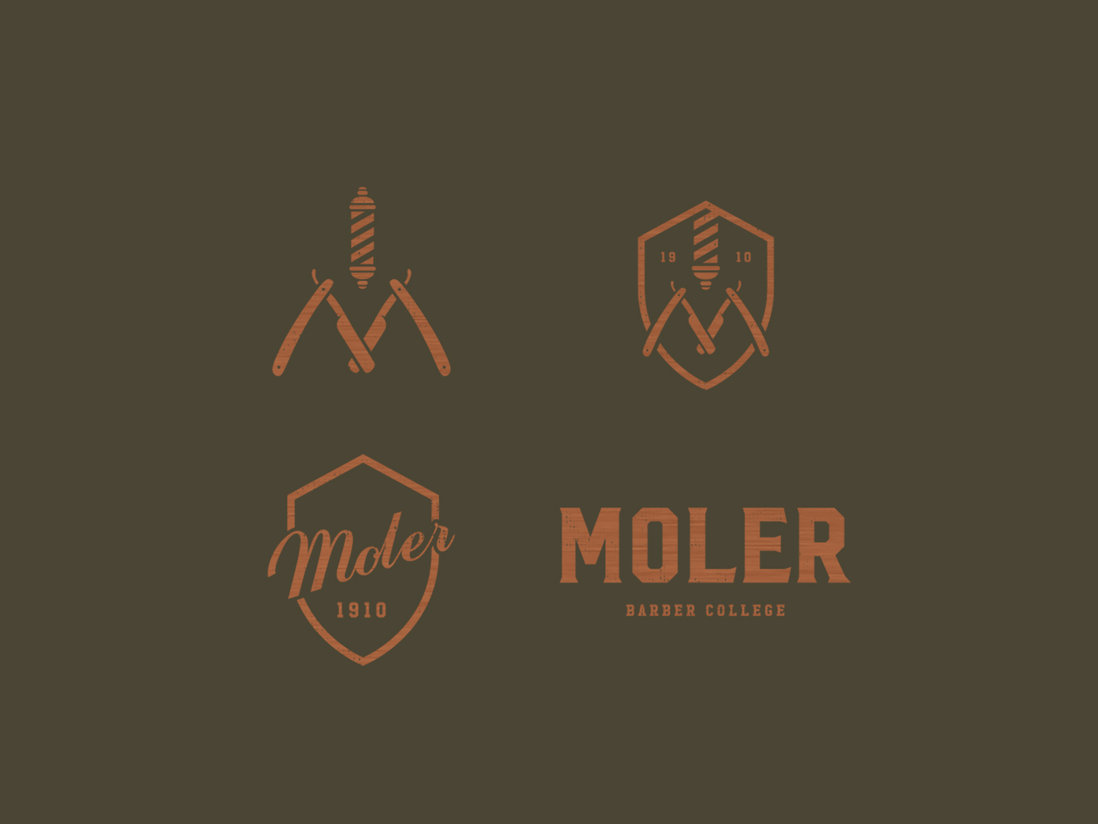
Moler Barber College
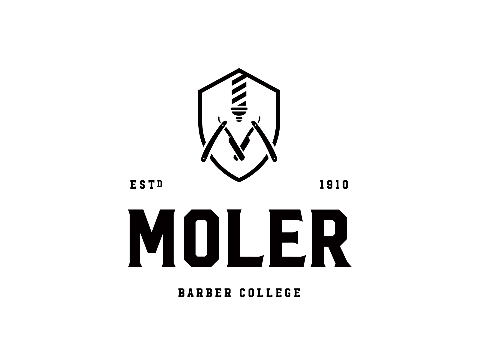
About This Project
Frank and Christina Quattro asked us to redesign their barber school brand and assets; something that could stand the test of time and provide their schools a broader appeal. They were in the process of revamping the space where they hold classes, and decided the product should speak true of their students. So, we gave them a traditional mark harking back to the years where the barber poles turned and the cuts were sharp and a couple of coins.
We are pleased to help the up and coming talent of Oakland look and feel good where they go to school.